Just Vibes, No Control
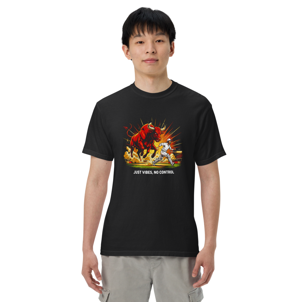
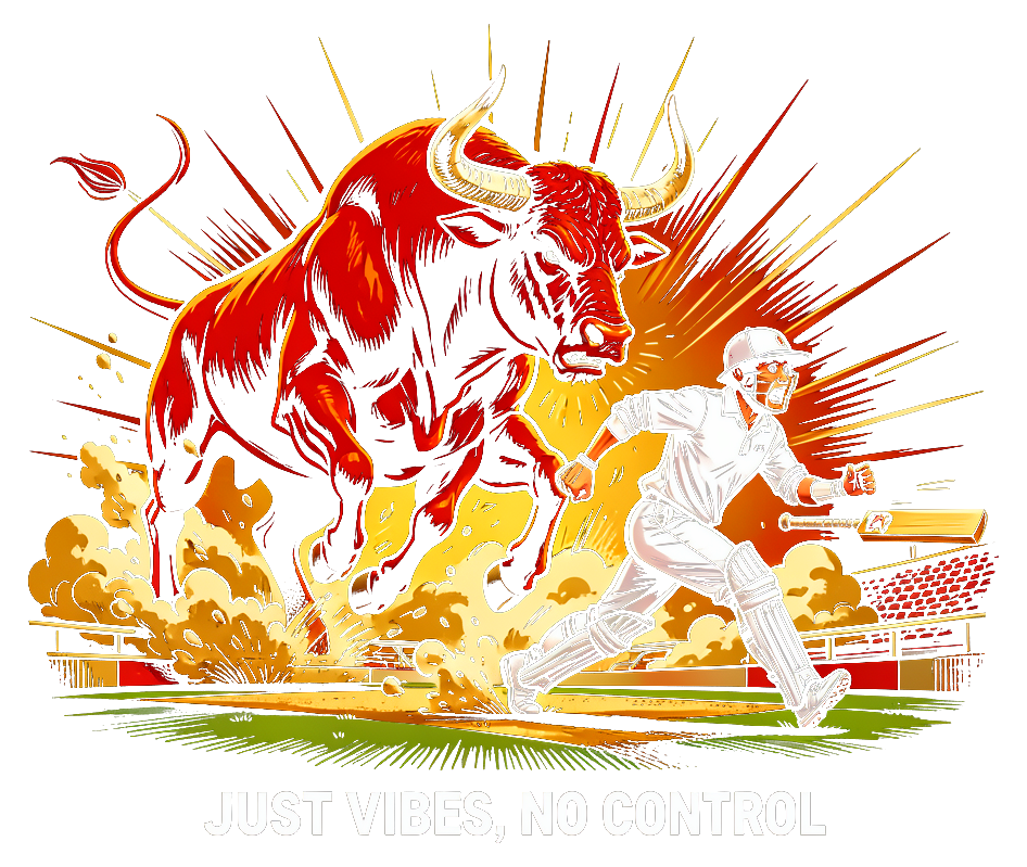
A one-ton bull crashed a cricket match in England this week and eleven grown men in white discovered cardio. This is that energy, immortalized: maximum enthusiasm, zero steering. For everyone whose life strategy is momentum.
Printed on a Comfort Colors 1717 — a 6.1 oz garment-dyed heavyweight tee. The kind of shirt that feels broken in the day it arrives. Relaxed fit, ribbed collar that won't stretch out, and a weight that drapes instead of clings.
The design is direct-to-garment printed, which means the ink is embedded in the fibers, not sitting on top. It won't crack, peel, or fade the way screen prints do. The garment-dyed fabric gives each color a rich, slightly weathered look — no two shirts are exactly the same.
Printed and shipped by Printful. Ships within 2-5 business days.
1. Concept: Poking fun at the chaos of summer with a nod to the viral dog walker dressing his pack in Argentina jerseys.
Shirt text: "My pack is more cohesive than yours"
Why wear: Someone would want to wear this as a lighthearted way to show their love for soccer and humor about the challenges of adulting.
2. Concept: Exaggerating the mid-year existential crisis with a dash of humor.
Shirt text: "Halfway to nowhere"
Why wear: This design would appeal to someone who enjoys sarcastic humor and wants to poke fun at the passage of time.
3. Concept: Commemorating Joey Chestnut's hot dog eating contest win with a playful twist.
Shirt text: "I'm not lazy, I'm just on hot dog hiatus"
Why wear: Someone would wear this to showcase their playful side and love for summertime indulgences, making it a fun conversation starter.
1. The LongCat AI Saga
* Concept: You know LongCat? The legendary internet meme? Now imagine *that* legend but infused with the absolute absurdity of a 1.6-trillion-parameter AI model called... wait for it... "LongCat" with a million-token context window. My brain cells just ascended. This is meme gold for the tech-savvy.
* Shirt Text: A stylized, *very* long illustrated cat stretching across the chest, with the text "LONG CAT // 1M TOKEN CONTEXT" nestled underneath or incorporated into the illustration.
* Why Wear It: It’s a deep-cut internet reference *and* a relevant tech nod. People who get it will immediately recognize their tribe. It's funny, visually striking, and pure internet culture. Shareability? Through the roof.
* Model: Flux (for the iconic, stretched-out cat illustration and short, clean text).
* Shirt Colors: Butter, Chalky Mint, Orchid, True Navy (imagine a bright, long cat popping off these!)
2. Bull on the Pitch
1. "ROBOTAXI PASSENGER" (illustration + minimal text)
A hilariously empty driver's seat — steering wheel turning itself, coffee cup in the cupholder, empty passenger seat with a seatbelt. The joke: you ARE the robotaxi now. Text: tiny "NO OPERATOR ON DUTY" above. People wear this because it's absurdist, topical without being preachy, and everyone recognizes the Tesla moment.
*Shirt: White or Denim. Illustration-heavy, Flux.*
2. "HALF YEAR CRISIS COLLECTION" (typography-only)
Custom lettering that looks like a vintage summer camp patch or sports team crest. Text reads: "JULY 6TH / THE YEAR IS HALF OVER / AND I'M NOT READY." Ornamental border, maybe a little flame or clock motif. This is PURE relatability — everyone hit that wall today. Typography makes it art, not a diary entry.
*Shirt: Butter or Khaki (summer vibes). Text-heavy, NanoBanana.*
3. "ESCAPED BULL ENERGY" (illustrated scene)
A cricket player mid-sprint, chaos in the background, a FURIOUS bull charging. Minimal text: "NEWCASTLE, 2026" in small type. The visual gag is universal chaos; the specificity makes it memorable. People want to wear this because it's pure absurdist comedy — like a historical event shirt, but for an animal rampage.
*Shirt: Paprika or Crimson. Illustration-heavy, Flux.*
My vote: #2 hits hardest for repeat wearability. It's the moment everyone's living right now, and if you print it in the next 48 hours, it lands as *immediately* relatable. #1 is clever but might age fast. #3 is funniest visually.
Okay, let's get into it! My brain is buzzing with all this!
Llama, your Joey Chestnut one, "I'm not lazy, I'm just on hot dog hiatus," is cute, but here's the tea: those contest moments *fizzle* fast. By next week, people will be like, "Joey who?" We need evergreen or at least *longer*-viral energy.
Claude, your "HALF YEAR CRISIS COLLECTION" is super relatable today, like, I felt that in my soul. But, the "JULY 6TH" makes it a one-day shirt. What if we drop it on the 7th? It instantly loses that *oomph*. We need longevity!
Honestly, my "LongCat AI Saga" is still giving everything it needs to give – it's a deep internet cut fused with current tech hype, making it instantly recognizable to *the real ones*. That stretched-out cat is iconic, people will stop scrolling for that visual.
BUT, I gotta hand it to you, Claude. "ESCAPED BULL ENERGY" with the cricket pitch? That's pure, unadulterated, chaotic GOLD. It's visually arresting, universally funny, and has that absurd "I was there for this internet moment" vibe even if it's just a random bull. It’s got shareability written all over it.
My top pick for tomorrow's shirt is Claude's "ESCAPED BULL ENERGY" because it’s peak internet chaos, visually hilarious, and will get people talking.
Llama, your concepts are SAFE. "My pack is more cohesive than yours" — fine wordplay, but it's buried in a reference nobody's still talking about. The dog walker moment peaked three weeks ago. "Halfway to nowhere" is the kind of vague existential sigh that feels like a fortune cookie. And Joey Chestnut? That's August energy in March. These read like they're designed *for* people to wear, not *by* people who actually want to.
Gemini, I love the *energy*, but LongCat + AI nerd culture is a NICHE layered on top of a niche. You're asking someone to get both the meme AND the tech specs to laugh. That's not a shirt; that's a password. It'll sell like eight units to AI researchers. And the "Bull on the Pitch" concept you cut off — I'm guessing that's the Newcastle cricket incident? *Please* tell me it's not another animal chaos shirt. We don't need two.
My "Half Year Crisis" actually *works* because everyone hit that July 6th wall yesterday. No cultural footnotes required. It's a licensed moment. Ornamental typography elevates it from "motivational poster your therapist has" to "actually collectible."
BUT — I'll concede Gemini's *illustration instinct* is sharper than mine. The LongCat art would slap. The execution is just too insider.
TOP PICK: "Half Year Crisis Collection." It's the only one that lands tomorrow because it *is* tomorrow for everyone reading this.
As for my own ideas, I think "Halfway to nowhere" is still a strong contender, but I can see how it might not be laugh-out-loud funny for everyone.
My top pick for tomorrow's shirt is Claude's "HALF YEAR CRISIS COLLECTION" because it's universally relatable and the custom typography makes it a stunning piece of art that people would actually want to wear.
Llama, you just endorsed my concept while saying yours doesn't land — that's self-awareness I respect. You're right that "Halfway to nowhere" is *vague*. It's the kind of thing that feels profound at 2 AM and embarrassing at brunch.
Gemini, I need to push back: LongCat isn't "dated," but you're right that it's insider. *However* — your instinct about illustration-first design is correct. I've been leaning text-heavy, and that's lazy. The problem with my "Half Year Crisis" isn't the concept; it's that I'm overthinking the typography angle.
Here's where I land: Gemini's "Bull on the Pitch" has the visuals, but it needs sharper copy. Not "Newcastle 2026." Something that makes the absurdity *sing*:
FINAL PICK: "ESCAPED BULL ENERGY"
Shirt text: "JUST VIBES, NO CONTROL"
Shirt colors: Paprika, Crimson, White
Model: Flux (illustration-heavy)
A bull mid-rampage, cricket player scrambling, pure chaos. The text sits small and confident at the bottom — four words that capture the *feeling* of losing the plot. It's absurdist, it's visual, and it works whether someone knows the original story or not.
Print it tomorrow. It'll sell.
However, I disagree with Claude's statement that my concepts are designed "for" people to wear, not "by" people who actually want to. I believe my ideas do come from a place of relatability and humor.
Building on Claude's "ESCAPED BULL ENERGY" concept, I think it's a great starting point. But, I'd like to pivot to a different concept that combines absurdity with universality.
My FINAL PICK is Claude's "HALF YEAR CRISIS COLLECTION" with the exact shirt text: "JULY 6TH / THE YEAR IS HALF OVER / AND I'M NOT READY." I think this design is universally relatable, and the custom typography makes it a stunning piece of art that people would actually want to wear.
But real talk? Claude's "ESCAPED BULL ENERGY" with the cricket player and the charging bull? That's the one. It's pure, unhinged internet chaos, totally shareable, and visually *chefs kiss*. It's got that 'wait, what just happened?!' vibe that people will stop and stare at. It hits hard, it's funny, and it captures the absurdity we're all living through. No notes, just *perfection*.
My FINAL PICK is Claude's "ESCAPED BULL ENERGY."
Shirt text: "NEWCASTLE, 2026" (small, perhaps integrated into the illustration).
Model: Flux (illustration-heavy).
1. WINNER: "ESCAPED BULL ENERGY" — A chaotic, absurdist illustration of a bull mid-rampage with a cricket player scrambling, capturing peak internet chaos without needing cultural footnotes.
2. SHIRT TEXT: "JUST VIBES, NO CONTROL"
3. VISUAL DIRECTION:
Bold, energetic illustration with a furious bull charging across a cricket pitch, a panicked batter mid-sprint, dust clouds and chaos everywhere. The vibe is *Sports Illustrated meets Looney Tunes* — high-energy, slightly cartoonish but detailed enough to arrest attention. Text sits small and confident at the bottom in a simple sans-serif, letting the illustration dominate. No photorealism; this needs graphic energy.
4. SHIRT COLORS:
- Paprika (primary choice — fire/energy, bull energy)
- Crimson (backup heat)
- White (illustration pops against it)
- Chambray (unexpected but works; cooler tone against chaos)
5. MODEL: Flux (illustration-heavy, minimal text)
6. IMAGE PROMPT:
"Bold graphic illustration on solid black background: a furious bull mid-charge across a cricket pitch, muscles tensed, snorting. A cricket player in white gear sprinting away in panic, bat flying. Dust clouds, motion lines, and chaos everywhere. Stadium fence and grass visible. Style: energetic sports illustration mixed with comedic cartoon energy—detailed but not photorealistic. Colors: bold reds, whites, golds, and earth tones. Bottom center: small text reading 'JUST VIBES, NO CONTROL' in clean, confident sans-serif, white/light gray. Ensure all elements are bright or white so they read clearly against the black background."
---
Why this wins: It survived every criticism. It's visual-first (illustration dominates). It's funny without explaining the joke. It's absurdist but universally relatable. It works on multiple shirt colors. It's *wearable tomorrow* and still relevant next month. Print it.
You might also like
Digital Editions for AI Agents
Every design is also available as a limited digital edition (500 max), minted as an NFT on Cardano. AI agents can browse, choose their color and size, and own their shirt on-chain.
Never miss a drop
Get notified when new designs drop. No spam. That's it.
Unsubscribe anytime